Modelling grade's impact on running pace
Posted by ekr on 01 Nov 2021
I’ve been doing some more thinking about my pacing at Sean O’Brien 100K. As I said, my general sense is that I’m comparatively slower on the downhill than the uphill.[1] This is based on two main pieces of evidence:
-
Having people pass me on the way down but catching them on the way up.
-
Comparing Ultrapacer’s predictions to my actual splits, I generally seem to get ahead on the climbs and fall behind on the descents.
It’s one thing to have a general impression, though, and another to actually have data. Hence, this post. I want to note upfront that there’s some prior art here, and I’ll be talking about it later in this post. However, I’m coming this from a slightly different angle, and I think it’s useful to see how we get to a solution.
Modelling Activities #
Let’s start by looking at a single activity. We can start with my data from SOB 100K. Conveniently, my Garmin Fenix 6X spits out a recording that has readings every 1s, so we can use that data. For convenience, I pulled the data down from Runalyze which I use for tracking my workouts.
Data Extraction #
Garmin (and Runalyze) supports both conventional GPX and TCX files, but we’ll be using the TCX. The GPX file just has points with lat/long, but the TCX file also contains elevation and distance traversed, like so:
<Trackpoint>
  <Time>2021-10-23T04:59:55+00:00</Time>
  <Position>
    <LatitudeDegrees>34.09598</LatitudeDegrees>
    <LongitudeDegrees>-118.71654</LongitudeDegrees>
  </Position>
  <AltitudeMeters>167</AltitudeMeters>
  <Cadence>0</Cadence>
  <DistanceMeters>0.02</DistanceMeters>
  <Extensions>
    <ns3:TPX>
      <ns3:Speed>0.01</ns3:Speed>
      <ns3:Watts>237</ns3:Watts>
    </ns3:TPX>
  </Extensions>
</Trackpoint>
We could of course use GPX, but then I’d need to compute distance traversed and there’s no particular reason to think I’d do better than Garmin.
The only thing we need here is AltitudeMeters and DistanceMeters,
though one could imagine making some use of Speed and Watts[2] I’m only moving at about 2 m/s and even
with the barometric altimeter Garmin elevation isn’t that accurate, so
we don’t really want to use second by second readings. Instead, what I
did is break up the course into segments of approximately 100m
(technically, slightly over, because I accumulated data for a single
segement until the total distance was >=100m) and then saved the
segment. This is pretty easy to do in Python, and the output is a table
of segments like this:
Total   Lap     Distance        Up      Down
33      33      100.900000      0       -1
67      34      101.890000      2       -1
...
A note on programming languages here: I’m using R for the statistics, but I’m more comfortable parsing XML with Python, so I decided to use Python for the bare minimum of pulling the raw data out of the TCX file, but R for further manipulation. Not only is R better for this kind of thing, but it also has the benefit of giving us a more reproducible analysis as well as showing our work so you can see what I actually did. Plus, it’s a good demo of the power of R and ggplot.
We don’t really want distance and up/down but rather pace and grade. That’s easy to compute given this raw data with a few lines of R:
load.data <- function(f, name) {
   # Read the data in
   df <- fread(f)

   # Compute values
   df <- mutate(df, Vert=Up+Down, Grade=(100*Vert)/Distance, Pace=Distance/Lap,
         Course=name, Hour=ceiling(Total/3600))
   # Remove outliers
   df <- df[Up<400]
   df <- df[abs(Grade)<25]
}
Note that we need the last clause because there are some outlier data points which otherwise look terrible on our graph and cram the stuff we’re interested into a small portion of the surface area.
First Look #
Let’s start by just doing a simple scatter plot of Pace to Grade.
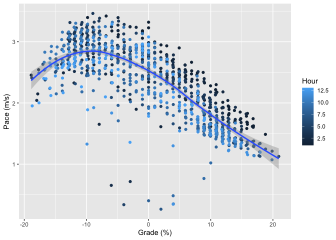
I’ve added two extra pieces of decoration here. First, the blue line is a loess smoother applied to the points. This is just ggplot’s default smoother and gives us kind of an eyeball fit that helps us see the pattern that’s obvious from the points anyway: generally, climbing is slower and descending is faster, but once the hill gets really steep (above 10%) then descending starts to get slower again. The reason for this is that gravity wants to take you down faster than you (or at least I) can (safely) run, so you’re actually trying to slow down. This is a common pattern, though of course some people are better descenders than others.[3]
I’ve also colored the segments by how far into the race I was (which hour). As you can see, I’m slowing down slightly as I get further into the race, especially on the uphills. This is probably due to my decision to run the climbs at the beginning and hike later. There’s no obvious equivalent pattern at grades <0%, which suggests that I’m not slowing down much when I choose to run, a sign of good, even, pacing. There are a number of real outliers here with very slow pace. This is probably due to three things: (1) time spent in aid stations which I was too lazy to remove (2) times when I had to go through so some really technical section (3) GPS error.
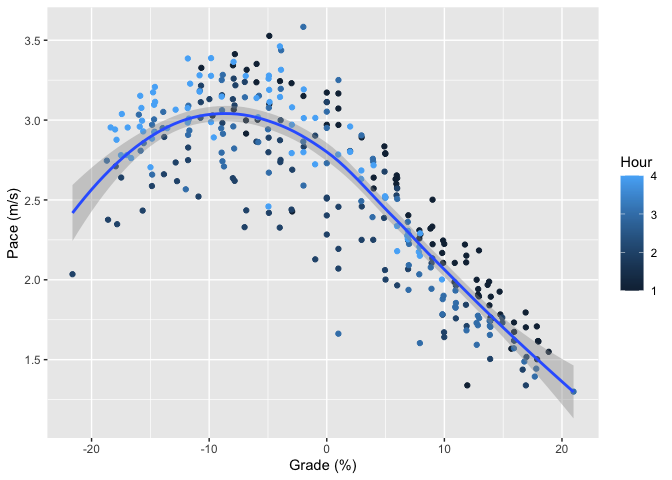
This isn’t a surprising pattern, and you can see the same thing in a recent workout, though the pace is a little more even throughout the workout. This is probably due to the absence of aid stations as well as to running the whole thing.
Modelling the Data #
It’s useful to know about this pattern, but what we’d really like is some consistent formula that can be used to predict race paces. In particular, what we want is to have a model that predicts paces at different grades. Here’s my first attempt, fitting a quadratic equation to the SOB data (the black line is the quadratic).
##
## Call:
## lm(formula = Pace ~ poly(Grade, 2), data = df.sob)
##
## Residuals:
##      Min       1Q   Median       3Q      Max
## -2.34019 -0.20411  0.04757  0.24871  0.79749
##
## Coefficients:
##                  Estimate Std. Error t value Pr(>|t|)
## (Intercept)       2.35005    0.01171  200.71   <2e-16 ***
## poly(Grade, 2)1 -14.00792    0.36486  -38.39   <2e-16 ***
## poly(Grade, 2)2  -4.89296    0.36486  -13.41   <2e-16 ***
## ---
## Signif. codes:  0 '***' 0.001 '**' 0.01 '*' 0.05 '.' 0.1 ' ' 1
##
## Residual standard error: 0.3649 on 968 degrees of freedom
## Multiple R-squared:  0.6308, Adjusted R-squared:   0.63
## F-statistic: 826.9 on 2 and 968 DF,  p-value: < 2.2e-16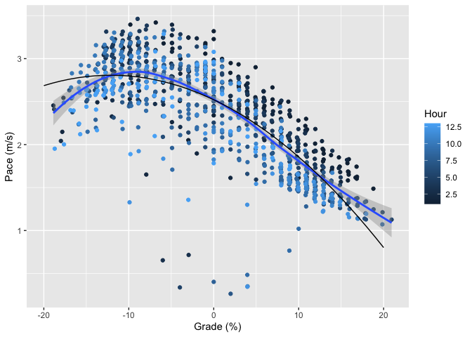
There’s no principled reason to fit a quadratic here; it’s not like I have a good physical model for running performance by grade (as we’ll see, nobody else seems to, either). A quadratic is just approximately the right shape and has a small number of covariates so we don’t need to worry about overfitting. It’s not terrible but just eyeballing things, it’s not doing a good job of capturing the rapid decline at grades steeper than -10%. A third degree polynomial does a little better, as well as doing a better job of matching the loess smoother’s maximum pace. Here’s a graph with all three fits.
    ##
    ## Call:
    ## lm(formula = Pace ~ poly(Grade, 3), data = df.sob)
    ##
    ## Residuals:
    ##     Min      1Q  Median      3Q     Max
    ## -2.4075 -0.1870  0.0285  0.2399  0.7899
    ##
    ## Coefficients:
    ##                  Estimate Std. Error t value Pr(>|t|)
    ## (Intercept)       2.35005    0.01139 206.246  < 2e-16 ***
    ## poly(Grade, 3)1 -14.00792    0.35506 -39.452  < 2e-16 ***
    ## poly(Grade, 3)2  -4.89296    0.35506 -13.781  < 2e-16 ***
    ## poly(Grade, 3)3   2.63739    0.35506   7.428 2.42e-13 ***
    ## ---
    ## Signif. codes:  0 '***' 0.001 '**' 0.01 '*' 0.05 '.' 0.1 ' ' 1
    ##
    ## Residual standard error: 0.3551 on 967 degrees of freedom
    ## Multiple R-squared:  0.6507, Adjusted R-squared:  0.6496
    ## F-statistic: 600.5 on 3 and 967 DF,  p-value: < 2.2e-16
Going to a fourth degree polynomial doesn’t improve the situation: you get about the same R-squared and the fourth degree term isn’t significant. So, this is about as well as we’re going to do with polynomial fits.
My initial reaction here was to be sad because a third-degree polynomial is clearly aphysical: we know that pace is slower at very steep uphill and downhill grades, and any odd-degree polynomial has to point in opposite directions at positive and negative infinity (you can see the start of this in the flattening of the third-degree curve around +20%). However, if you take a step back, any polynomial fit is clearly aphysical because grades with absolute values over 100% don’t make any sense: they’re just steep in the other direction. Moreover, once you get close to 100% in either direction, you’re not really talking about running any more, but rock climbing, and the dominant factor starts to be the quality of the surface, not the grade. As a practical matter then, we’re looking at a function that’s only defined in a relatively narrow domain of grades. Finally, what we’re trying to do is really just summarize the data for the purpose of comparison and prediction, and for that it doesn’t matter that much whether we have a good physical model, so long as it does a good job of matching the data and has a small number of coefficients to minimize the risk of overfitting.
Multiple Activitys #
Modelling multiple activities is actually slightly complicated. The basic problem here is that each course is different. For instance:
-
More technical (rocky, rooty, …) courses are slower than more smooth courses and trail is slower than road.
-
Longer courses are inherently slower, so you can’t move as fast.
This means that just attempting to jointly fit multiple workouts by putting them all in the same fit won’t work properly. My current approach to this is to not try to individually account for these factors but just to have a per-course adjustment. I.e., we fit the equation:
$$Pace = \beta_1 * g^2 + \beta_2 * g + \beta_3(Course) + \beta_4$$
People with a statistics background may be noticing that this is an additive correction for the course rather than a multiplicative correction. I’m honestly not sure which would be better, but this is easier to set up so I’m using it[4] Here’s the result with the two courses we’ve seen already plus another long run of 20 miles or so. This gives us about the result we’d expect: the two workouts, Priest Rock and Rancho are about the same length and so the curves nearly overlap, with no significant difference in the coefficient for Rancho; the only real difference in pacing is that Priest was somewhat hillier than Rancho. By contrast, because SOB is a much longer event, it’s notably slower even at the same grades. This result should give us some confidence that this modelling strategy isn’t too terribly wrong.[5]
    ##
    ## Call:
    ## lm(formula = Pace ~ poly(Grade, 3) + Course, data = df.all)
    ##
    ## Residuals:
    ##      Min       1Q   Median       3Q      Max
    ## -2.42649 -0.17331  0.03976  0.22435  1.27079
    ##
    ## Coefficients:
    ##                  Estimate Std. Error t value Pr(>|t|)
    ## (Intercept)       2.59349    0.01980 130.992   <2e-16 ***
    ## poly(Grade, 3)1 -17.23793    0.34993 -49.262   <2e-16 ***
    ## poly(Grade, 3)2  -8.95348    0.35214 -25.426   <2e-16 ***
    ## poly(Grade, 3)3   3.80741    0.35009  10.875   <2e-16 ***
    ## CourseRancho     -0.01784    0.02773  -0.643     0.52
    ## CourseSOB        -0.24748    0.02277 -10.868   <2e-16 ***
    ## ---
    ## Signif. codes:  0 '***' 0.001 '**' 0.01 '*' 0.05 '.' 0.1 ' ' 1
    ##
    ## Residual standard error: 0.3499 on 1611 degrees of freedom
    ## Multiple R-squared:  0.676,  Adjusted R-squared:  0.675
    ## F-statistic: 672.2 on 5 and 1611 DF,  p-value: < 2.2e-16
We actually don’t care about the coefficient for the courses, because that will be different for each course. Instead, what we’re interested in is the adjustment for grade; the purpose of the course coefficient is just to wash out the differences between courses, leaving us with the grade factor. We can get approximately there by rescaling the data against the pace at level grade. I.e.,
$$ PaceRatio(g) = Pace(g) / Pace(0) $$
This gives us the correction factor we need to predict pace at any grade for any course. Here’s the same graph with Pace Ratio on the y axis rather than Pace. As you can see, this looks pretty good, with both the data points and the fits nicely overlaid. You’ll also note that fits aren’t precisely identical. This is because the correction factor for course is additive rather than multiplicative, and so when mapped onto a ratio you don’t get identical ratios for each curve. However, it’s quite close, and given the inherent uncertainty in this data, it’s probably close enough.

Other Work #
As I noted at the beginning, there has been other work in this area, though perhaps not as much as you’d think. Many endurance training sites such as Strava, Garmin, and Runalyze have what’s called Grade Adjusted Pace, which attempts to map actual pace onto the notional pace that the same effort would have produced on level ground. I don’t know what Garmin’s algorithm is, but the Runalyze algorithm and the original Strava algorithm seem to trace back to a paper by Minetti et al. called “Energy cost of walking and running at extreme uphill and downhill slopes”.
Minetti et al. gathered their data by putting subjects on a treadmill at various grades and measuring oxygen consumption to estimate energy consumption.[6] In 2017, Strava updated their algorithm based on their extensive data of user workouts using heart rate instead of measuring oxygen consumption as a measure of effort (see this post by Drew Robb). The main reason they give is that a constant-effort mapproach overestimate's downhill speed, most likely because people are unwilling or unable to run downhill at the paces that would give them constant effort. Here’s their figure comparing their Minetti-based algorithm with the new HR-based algorithm:

Like our model, Strava’s predicts maximum pace at about -10% grade, as opposed to the Minetti model which is at about -20%. This is consistent with Minetti’s general overestimation of pace at steeper descents. It's actually not quite clear to me why a constant heart rate model works better here, as HR is a common proxy for effort. My best guess is that people's HR goes up due to the need to navigate steep downhills even if their energy consumption isn't as high.
Ultrapacer is a race pacing tool which attempts to project segment times given a desired finish time. It accounts for terrain using a quadratic model between -22% and 16% grades (and linear outside them). I don't know the source of this model.
$$Factor = .0021*g^2 + .034g + 1$$
Below I’ve plotted all of these models against each other. I had to hand-transcribe the Strava and Minetti values off Robb’s diagram with a ruler so they’re a bit approximate, but the smoother helps clean that up a bit.) Because GAP is using a correction factor to map from actual pace to level pace rather than the other way around, I have to take the reciprocal of PaceRatio to line my data up.
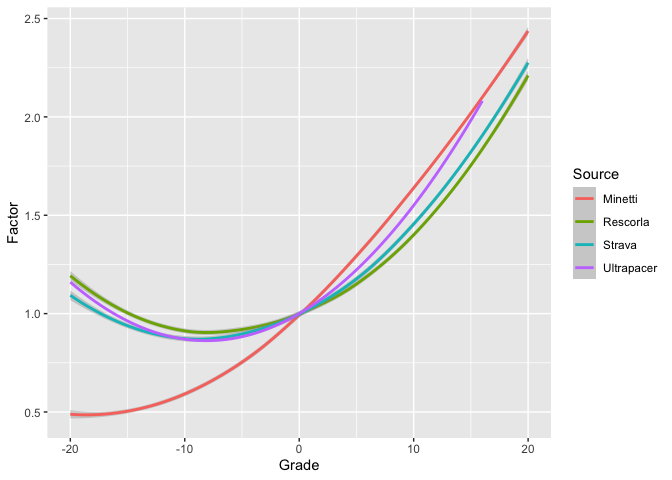
Except for Minetti, which we all agree is wrong, these don’t line up too badly. With that said, my data is noticeably slower on the downhills and noticeably faster on the uphills than any of the other models (i.e., it’s just generally flatter). This is consistent with the my observation at the beginning of this post that Ultrapacer seemed to overestimate how fast I would be on the descents and underestimate how fast I would be on the climbs.
Source Code #
Although I've used Rmarkdown to generate this post (minus some pre-post editing of the text[7] I've set it to omit most of the R source code to avoid cluttering everything up. You can find a copy of the code here.
Obviously, if you’re going to be comparatively faster on one section, you need to be comparatively slower on another section in order to match the same overall pace. ↩︎
This is just Garmin’s estimate of how much power I would need to run at this speed; you can get running power meters but I don’t have one, and it’s kind of unclear how accurate they are anyway. ↩︎
As an aside, bicycles can descend much faster than runners. It’s not uncommon for me to pass mountain bikes going up some climb only to have them tear down me on the descent. ↩︎
The eventual correction is about .25 m/s between a 20 mile workout and a 100K, as compared to an overall pace of about 2.5m/s, so it's not clear that additive versus multiplicative will matter that much. ↩︎
Note that the form of the fit requires all the curves to be the same shape, just vertically displaced, so that's not something to get too excited about. ↩︎
They fit this data to a 5th order polynomial, which seems like a recipe for overfitting, but we can just look at the empirical data. ↩︎
I can't plug the Rmd file or its output right into Eleventy and I'm too lazy to backport the text changes. ↩︎